Data Visualisation for Noobs (Like Me)! Mapping To and From Points – Part 2
Creating To and From Points: Dual Axis Mapping in Tableau
I’ve been meaning to write this blog on dual axis mapping for a while now, but didn’t have quite the right data set to exemplify the situation. But now that I do, let’s map London Tube Stations.
Please do note, that this data set in particular is made with custom geocoding, which maps all of the London Underground Stations. More information on this will be available soon from Naledi (link will be here). In addition to this, the data set had to be formatted so that each ‘To Station’ is aligned with each ‘From Station and vice versa. To do this, see Mapping To and From Points – Part 1: Cartesian Joins in Alteryx (http://wp.me/p6XID2-1ol).
Let’s build a the map. Bring latitude and longitude to the columns and rows shelves, respectively. To make a second map, hold control, click the latitude in the rows shelf and drag it to right next to itself. You will now have two maps.
In your marks card, navigate to the first latitude card and bring in the ‘From Stations’ pill from the dimensions. In the second latitude card, bring in the ‘To Stations’ pill. Both should go no detail. Change the colours to show the differences.
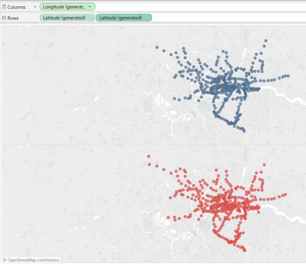
To make your map dual axis, simply click on the carrot on your second Latitude pill on your rows shelf and select dual axis.
To make things more interesting, bring your to and from stations out as filters. Right click (or click on the carrot) on a pill in the dimensions shelf, and select ‘show filter’, this will bring up quick filter on the right hand side of the view. You can then change the filter format, by clicking on the carrot of the filter and selecting for example, single drop down list.
Wrap it up by bringing it all together in a dashboard!
Hope that helped.