Data Visualisation for Noobs (Like Me)! – A Tableau based blog series
How to make a Diverging Bar Chart
There are a few things I keep forgetting how to do and one of them is diverging bar charts. 3 months into the data school, I really should know how to do this, it’s painfully simple, but I can never remember, so I thought I’d blog it, then I always know where to find the instructions.
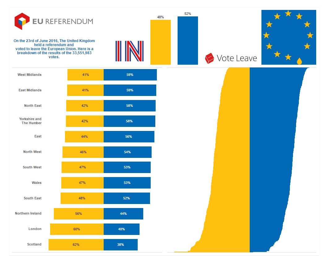
So here it is, using some data on the UK EU referendum. I wanted to plot the in and out votes, plotted as a diverging bat chart, as shown in the image above.
The solution:
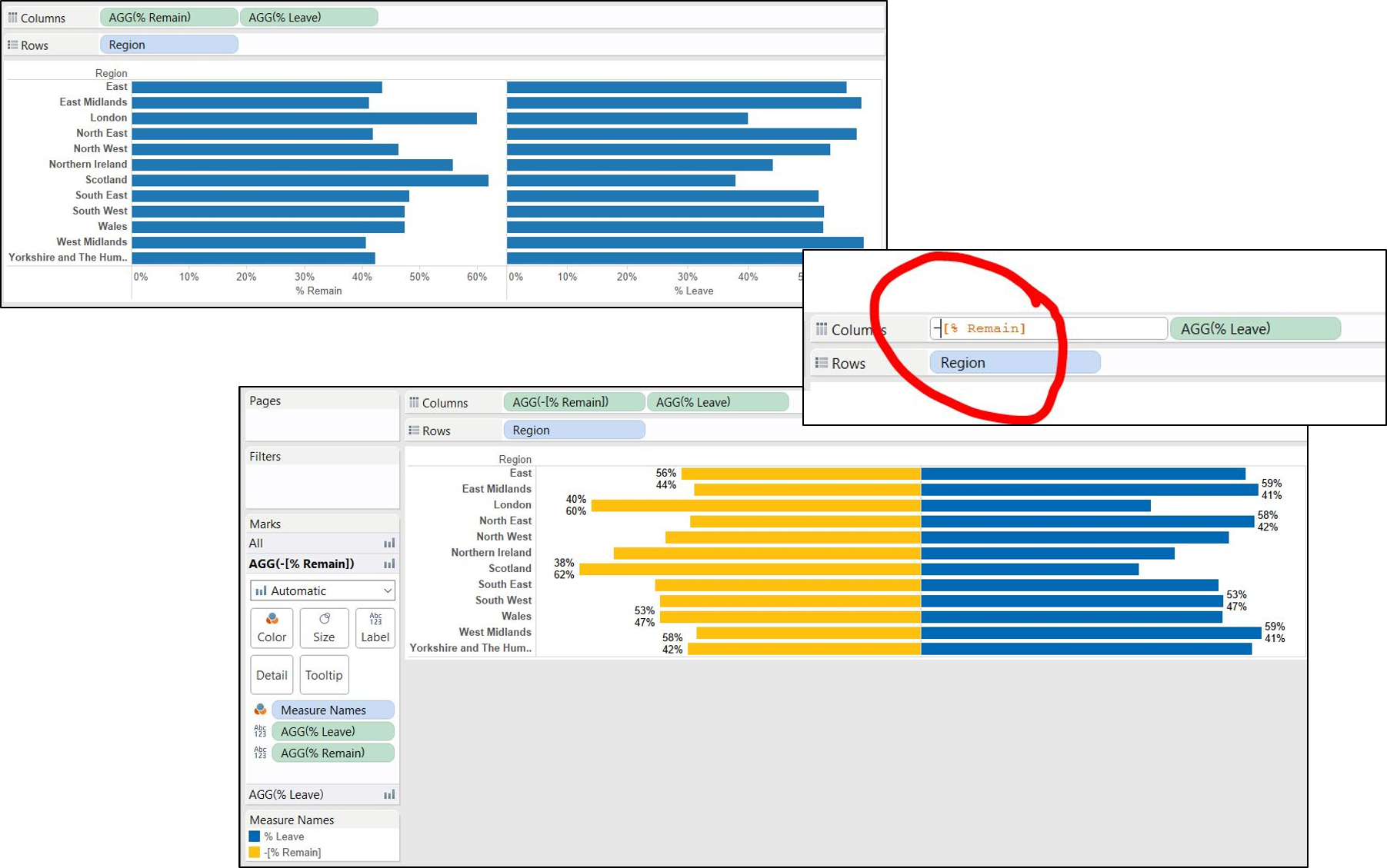
First, create calculated fields for the percentage of remain and leave votes.
% leave: SUM([Leave])/SUM([Leave]+[Remain])
% remain: SUM([Remain])/SUM([Leave]+[Remain])
Bring the dimension you want to split your data by into the rows shelf (regions), then both of the measures you want on your bars onto the columns shelf (% remain and % leave). Using an in-shelf calculation, by double clicking on the % remain pill in the columns shelf, place a minus sign in from of the measure. Bring both the %leave and % remain to the labels shelf. Right click on the % remain pill in the data pane and go to default properties and number format, click on percentage and change the decimals to 0 places. Do the same for the % leave. Bring both pills from the data pane to the labels shelf (best practice is to do this on the ‘all’ tab). Turn on the marks labels and you have your percentages! I removed the x axis as it’s confusing.
To colour the bars, you can either change the colours on the marks cards, or bring measure names to colour. You can now customise the chart however you want!