


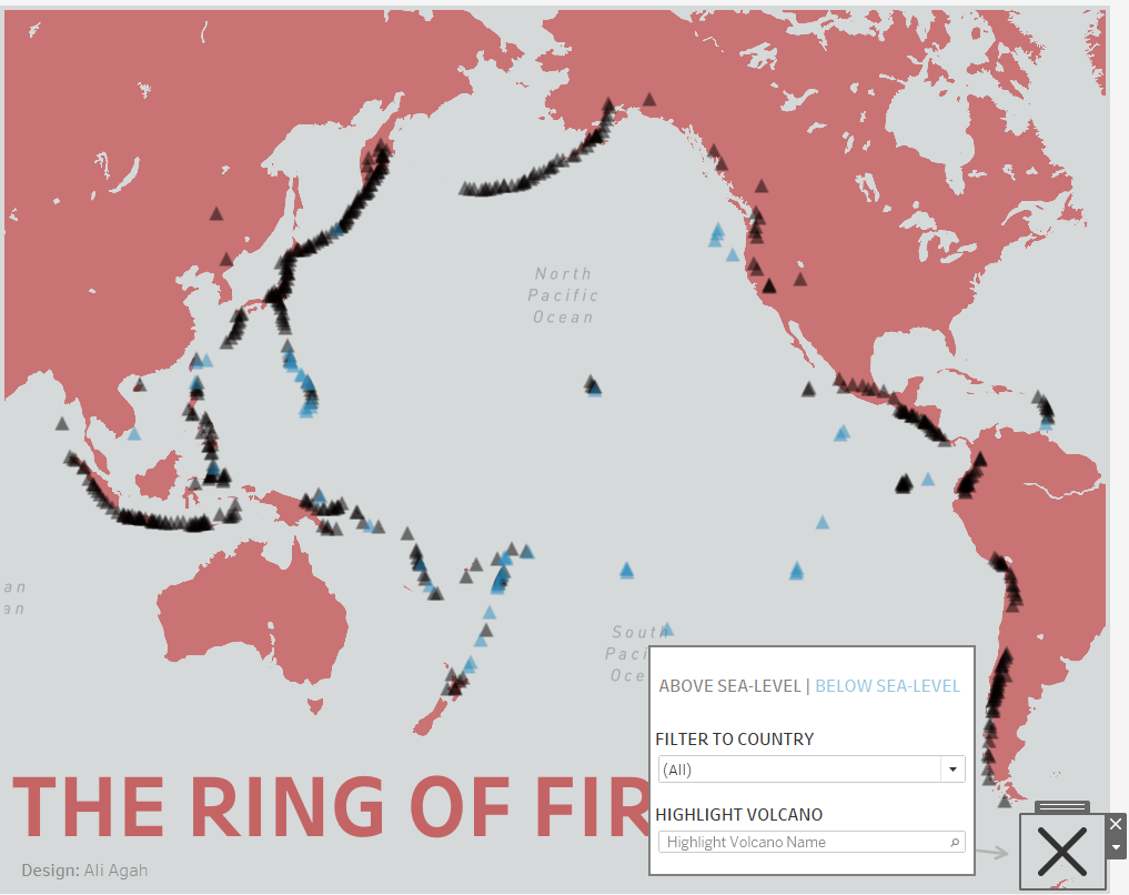
Sometimes I don't want to clutter up a dashboard by adding lots of text, filters and parameters but I also want the keep the interactivity they afford. So... I add them to the dashboard and hide them like the below.
Tutorial
- Place everything you want to show/hide in a floating container.
- Select the entire container, click the carrot and tick 'Add Show/Hide Button'
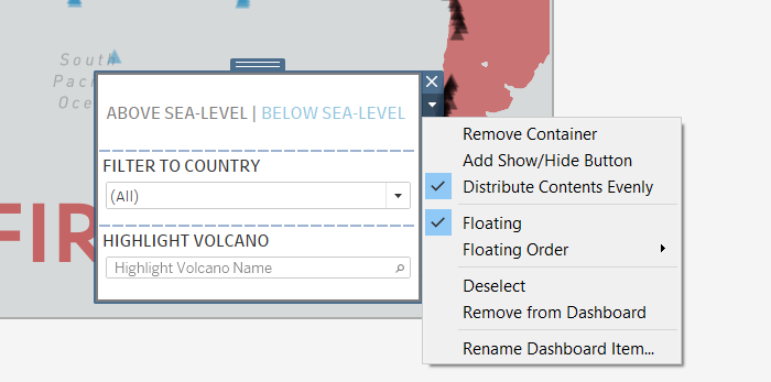
3. This will create a button which you can format using the Layout
Tips
While editing the dashboard, you can only interact with the show/hide button by alt+click. But when once presenting or publishing the dashboard, this changes to a normal click.
Also, be careful with overuse. I've come to realise people don't usually interact with the show/hide button without prompt. Don't hide containers unless you're sure you need to and have a prompt to encourage interaction.
For example, the colour legend in the dashboard above should probably not be ever hidden whereas the filter and highlight are not particularly important so they can be hidden.