We finally arrived at predictive analytics with Alteryx. The ability of business forecasting makes this the BI tool-of-choice (traditionally others rely only on historical data). Chris started us of with best practice techniques:
The first step is to create a sample – you might be asking yourself, why is this important? Simple, it will considerably speed up the investigation process. The second step is to test different models. Applying different statistical models in Alteryx takes only a few minutes, they can be compared and the best can be used to predict the future!
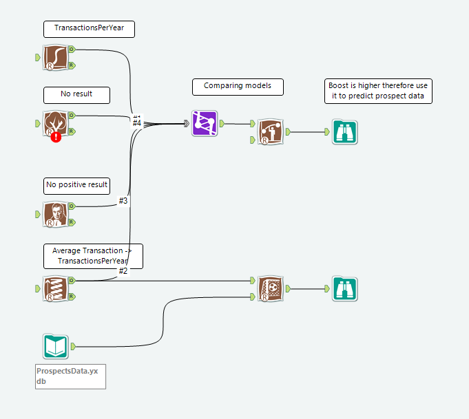
Alteryx workflow: data flows into statistical analysis tools (left) by joining (purple) them, predictve capabilities can be compared and applied to give future insight.
We could not wait for our first client project, the opportunity to work with real job scheduler data! Just to give you an idea of the magnitude of the work, the company produces 8 billion events a day. Our aim was to depict the overall structure. Initially, we planned to create an organizational network using sankey graphs, exemplified by Jeffrey A. Shaffer. Evaluating the viz, we decided to go for a more informative option by following the steps of creating Gantt charts. We delivered an effective dashboard to our happy client.
Interested in US doing a project for YOU? Please get in touch.
I leave you with a review of Dona M. Wong’s The Wall Street Journal Guide to Information Graphics (ISBN: 0393072959) ****
If you have suddenly become interested in deciphering financial data, this is your quick start guide. Dona takes you through a coherent collection of visualization best practices, with neat business examples. It can be read from start-to-finish on a weekend trip. The focus of this book is to clarify its page-sized illustrations of dos and don’ts. **
You start with a catch-up of fundamentals, how to present graphs, use of color, size and font, which I found a bit monotonous. For example, the book tells you to “use bold type to emphasize the focal point of the message”, which was something engrained in me since school. However, Dona is here making sure you don’t fall by doing common mistakes. The thing to look out for is how to “do the maths” for improving your scaling. One thing is certain, you will come back to this book again and again. **
I am currently reading Tableau Your Data! Review is coming soon.