The week that we have both been dreading and looking forward to in equal measures is finally upon us.
Andy first thing this morning passed the infamous ‘Cup of Numbers’ round the group, for each of us to make our selection. Depending on which number we picked, we were each to receive a different question to answer surrounding ‘NBA data’.
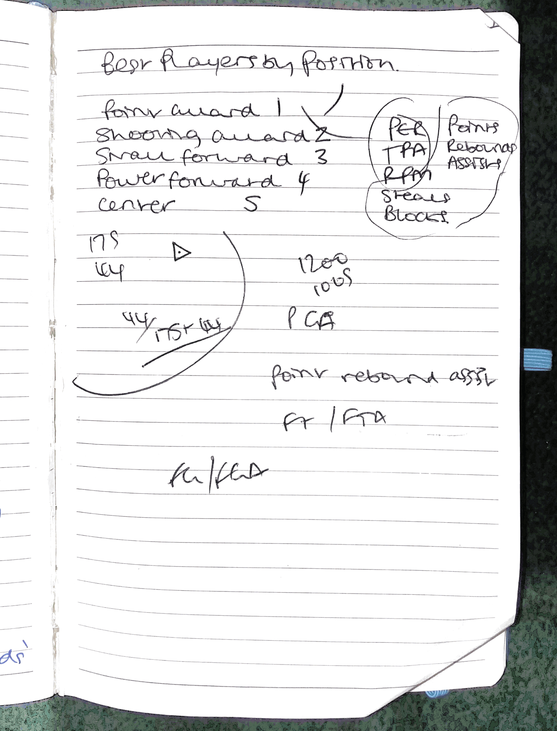
I pulled out the number 5, which meant the question that I needed to ‘show the best NBA players by their position’.
What to do?
Now, to begin with, this task was unnerving as I know nothing about basketball and, as it quickly transpired, the data surrounding it is technical and full of abbreviations that represented complex performance metrics.
That aside, the approach taken was no different to that which we have been coached to do up to now.
By doing some brief research, I ended up at the idea of how I could highlight specific player performance – thanks to some super blogs, mostly surrounding ‘The Four Factors of Basketball Success’ – a term coined by Dean Oliver. So, in scoping my data requirements, I knew what I needed to scour the internet to find to produce my result.
Understanding the problem.
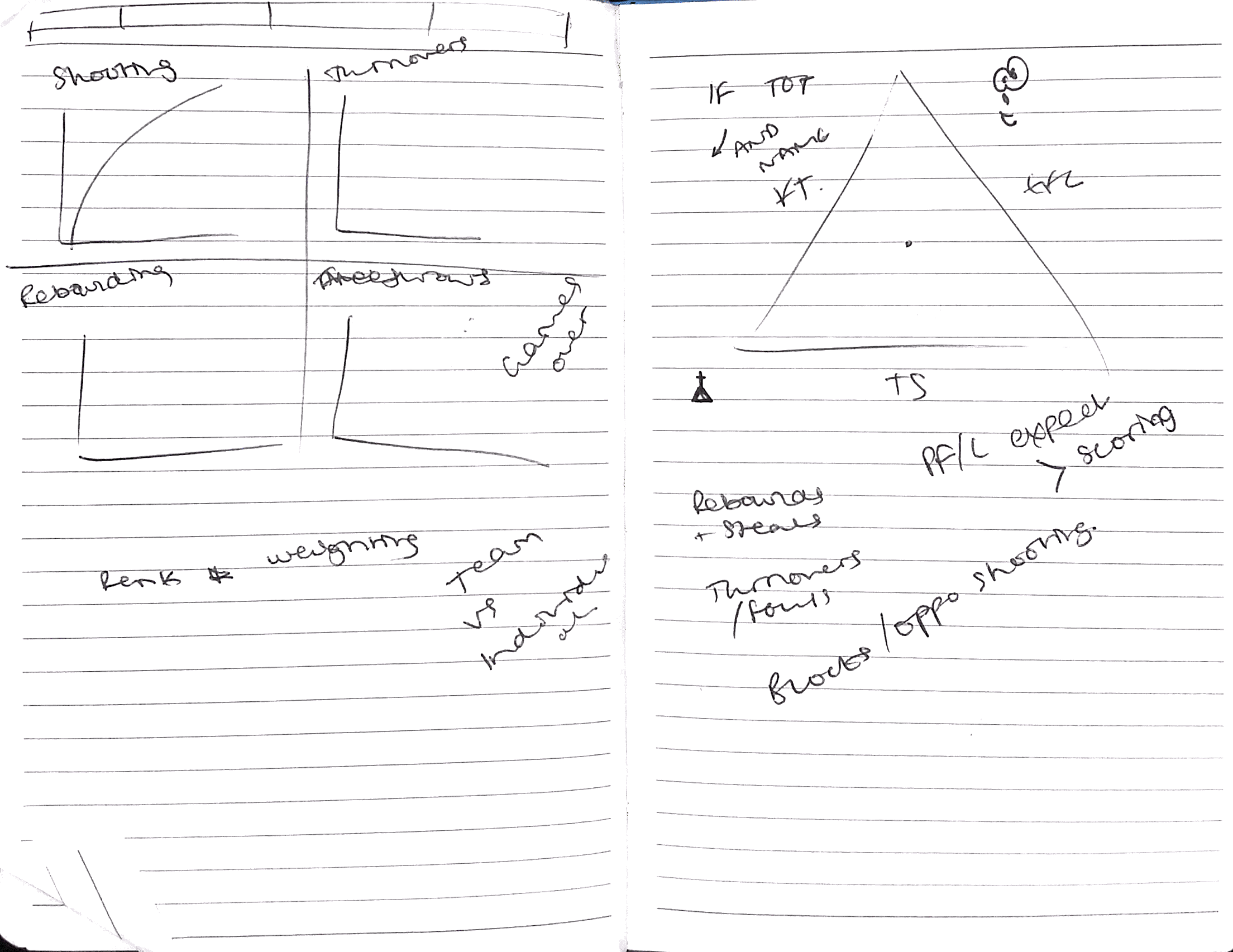
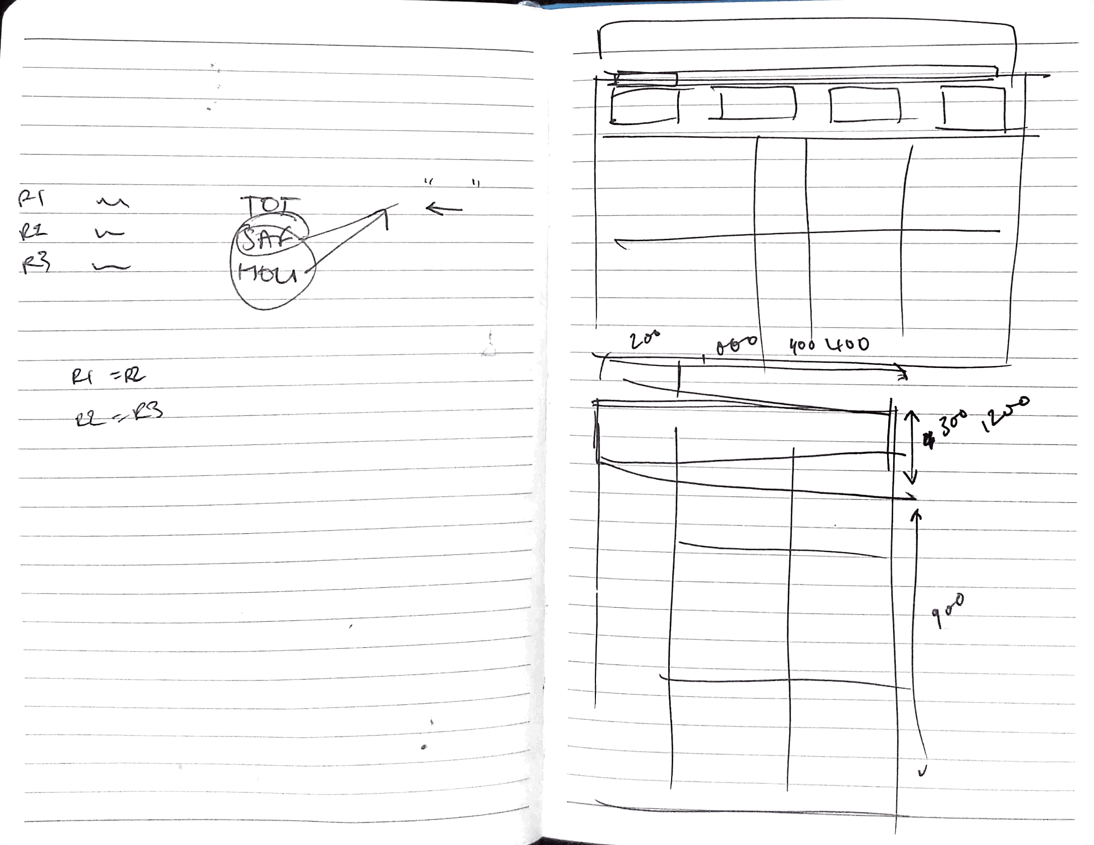
Knowing there were 6 key metrics before I started my data hunt had the peripheral benefit of allowing me to start to formulate in my head a rough layout for the resulting dashboard – using (again) the techniques afforded to us by Caroline Beavon in week 1, by sketching out some early designs.
No sooner had I started the search for data – did it become apparent that NBA data is a popular and, as such, much available resource – whether or not it is in a fit shape to be analyzed or actually contained the specific fields I required.
Several failed attempts later to pull information from various APIs, I was fortunate to stumble across ESPN as a data source. This provided me with last years’ NBA data – which was comprehensive enough to include all the required fields that I needed to produce today’s dashboard.
Getting to work on the data.
After some light cleaning in Excel, the data went into Tableau easily and I was able to mock up 6 worksheets with relative ease – at least, versus the usual rigmarole and stress I experience weekly with Andy’ ‘One Hour Makeover Monday’ challenge.
Plan of attack.
Each dashboard I create, I notice more and more how there is an almost unwritten formulaic and methodical approach to the way that I create my Vizes.
First the data – naturally – then I mock up worksheets, toy with dashboard containers, import the worksheets into my dashboard structure, dream up a color scheme (often inspired by the subject), and then finish up with tooltips and finer touches – always ensuring to double-check my data and calculations alongside.
At the end of the day, Gary.
Overall, I am happy with the final output – I went from knowing next to nothing about basketball to producing something that is informative and importantly answers the question originally asked. That said, I still feel like I have stuck close to my all too comfortable ‘classic style’, in that it is a white background with very much a corporate feel.
Therefore, the focus for the rest of the week is to push the boat out in terms of design and challenge myself, even if it results in failure! After all, ‘If you haven’t failed, you aren’t trying hard enough!’ – Jen Cruise.