


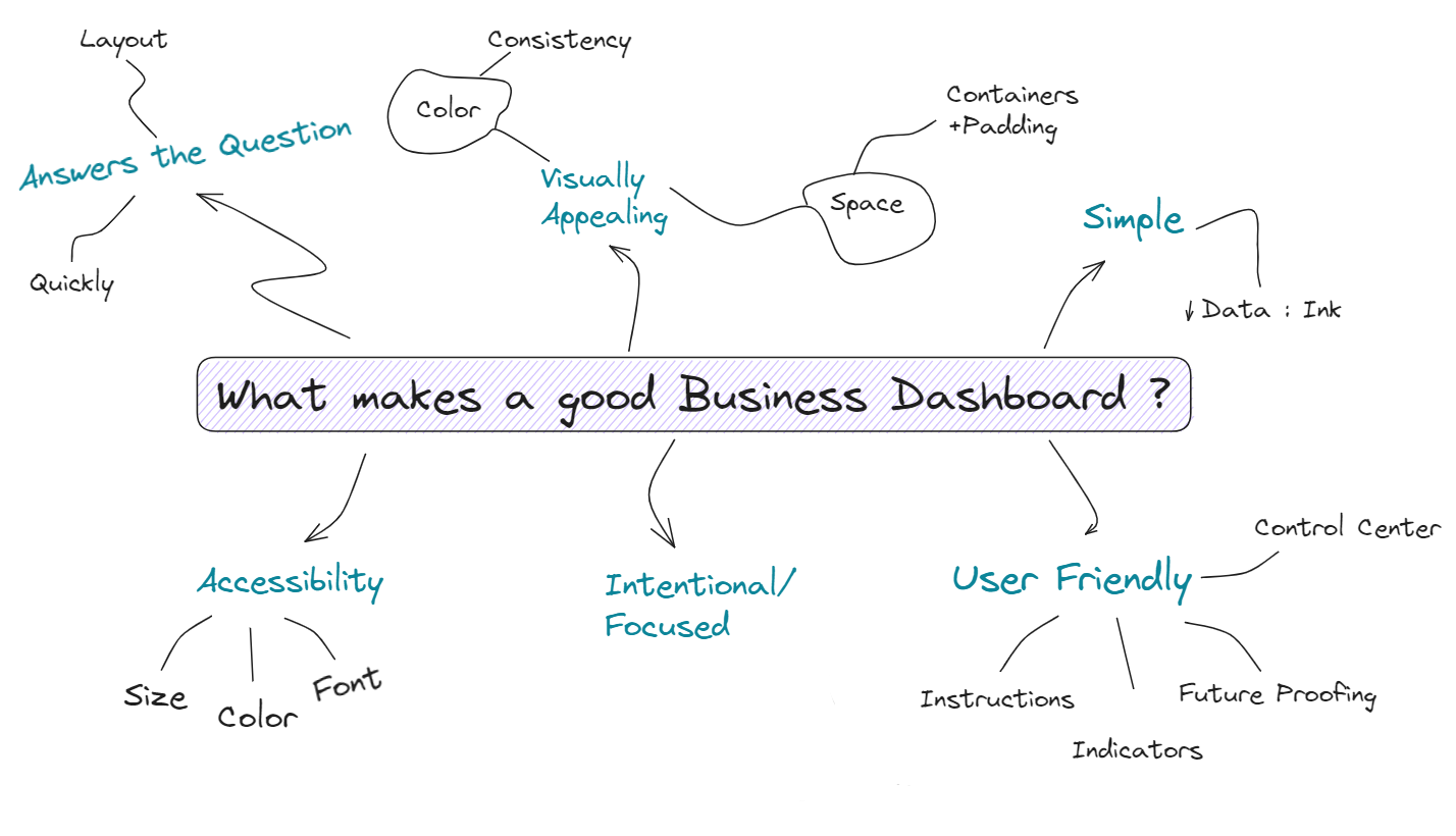
Creating an effective business dashboard requires careful consideration and attention to detail. Unlike personal project dashboards meant for public display on Tableau Public for example, a business dashboard is tailored to a specific audience and serves a distinct purpose. In this blog post, we will explore the qualities that distinguish a dashboard as a "business dashboard" and delve into the concept of the four C's, a set of guidelines that if implemented results in a dashboard that is visually appealing as well as functional, allowing the user to derive important business related insights from the data.
Let's dive into each of these categories and understand how these principles allow for a compelling dashboard.
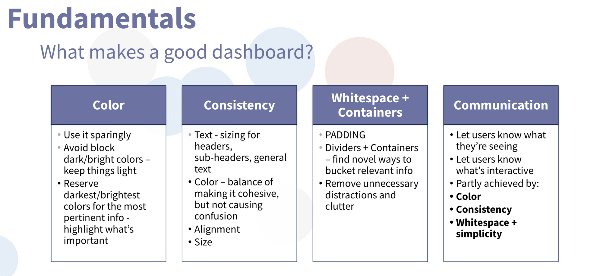
- Color: the use of color in a business dashboard should be approached with intention and moderation. Instead of opting for vibrant hues which can distract from important information, it is advisable to choose muted and de-saturated colors for the main body of the dashboard. If the company has specific brand colors that are bright for example, lowering the opacity of the colors will ensure that they don't overpower the data and become distracting. Simplicity is key when it comes to the color scheme, while also being mindful of accessibility guidelines. Dark and bright colors should be reserved for highlighting important information, such as significant insights or different categories of data. Doing so will allow for only the important information to shine through, allowing for quicker and more goal oriented design.
- Consistency: Having a consistent style throughout the entire dashboard also plays a crucial role in establishing a professional and cohesive look. Maintain a consistent visual style, including colors, font choices, chart formatting, alignment and layout. This will ensure a seamless user experience and help users navigate the dashboard with ease. If the design is consistent, the dashboard becomes more intuitive and user-friendly.
- Containers/Spacing: Proper use of containers and spacing also play an important role in creating a visually appealing and user-friendly dashboard. By giving charts and elements enough room to breathe, the dashboard feels more spacious and organized. This improves the overall aesthetics and makes for a better user experience. Containers act as virtual boundaries that group related components together, making it easier for users to understand the connection between different elements. They provide a structure for the dashboard and allows you to organize the layout in a way that allows for a logical flow of information. In addition to containers, spacing or padding also play a role in creating a clean and uncluttered dashboard. Proper spacing between charts, text, and other visual elements helps to reduce visual noise and enhances readability.
Side Note: We want to reduce non-essential elements such from our charts, such as gridlines, excessive labels, and decorative embellishments, effectively increasing the data to ink ratio, this results in a more efficient and effective data visualization. This concept highlights the importance of decluttering visualizations and focusing on the core message or insights conveyed by the data. A higher data ink ratio promotes clarity, simplicity, and enhances the audience's ability to interpret and extract meaningful information from the data being visualized.
- Communication: When creating a business dashboard it is important to communicate to the user how the dashboard should be used. This can be done in many ways, such as annotating or commenting on the dashboard or making it clear with certain symbols that direct the interaction of the user. It is important that the information communicated is clear as to not add any confusion. Having properly communicated the information needed to properly use the dashboard allows for smooth user interactivity
By considering these principles: Color, Consistency, Containers/Spacing and Communication; you can create a business dashboard that is visually appealing, user-friendly, and enables meaningful data-driven decision-making.