Task
So today the task was to analyse usage data innerly two half days. I chose Spotify data provided by Peter. The timespan was about 15 years so over different stages of life and potentially interesting. The deadline was offset to 14 hrs. the next day due to the company christmas event.
Process
The first stage was getting some inspiration for visualisations and to know the data. Spotify has a data documentation sheet available which was helpful in this endeavour.
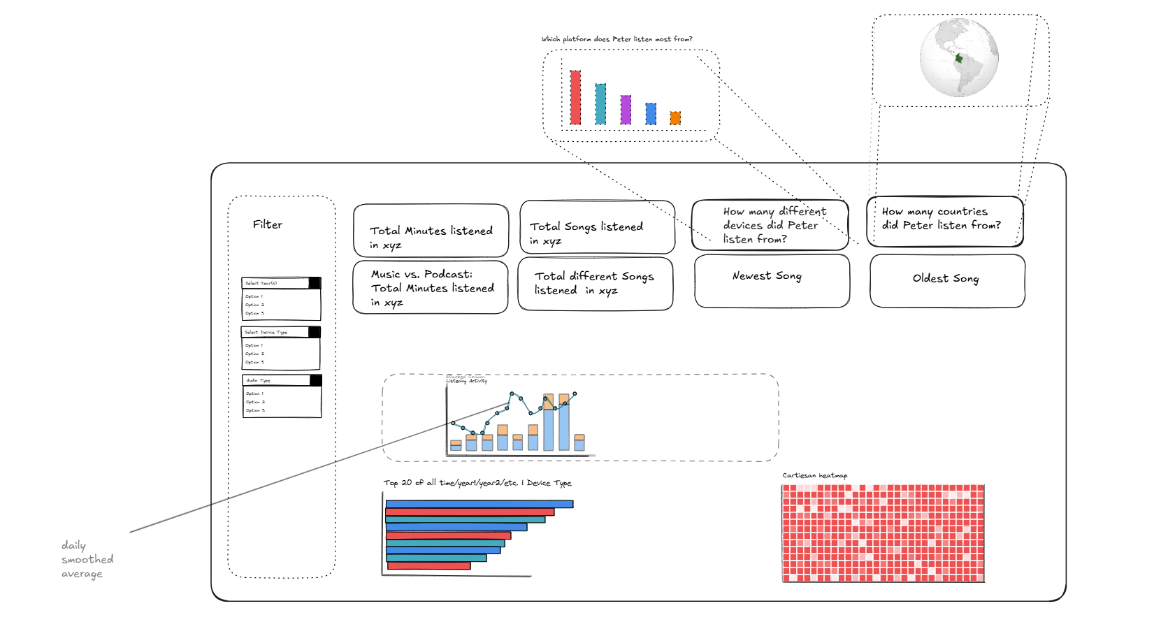
The next stage was to collect and brainstorm own solutions for how to bring the dataset to life, jotting down possible elements and sketching up the main task here.

I continued with joining 7 seperate datasets in Alteryx where I encountered some problems parsing data from JSON correctly. Also, pivoting data from rows to columns started to be tricky since the chosen identfier was not unique enough on its own. The combination of combining a generated ID with the Filename field turned out to be doing the work. To end of the transformation flow I parsed out the Timstamp field from string to datetime.

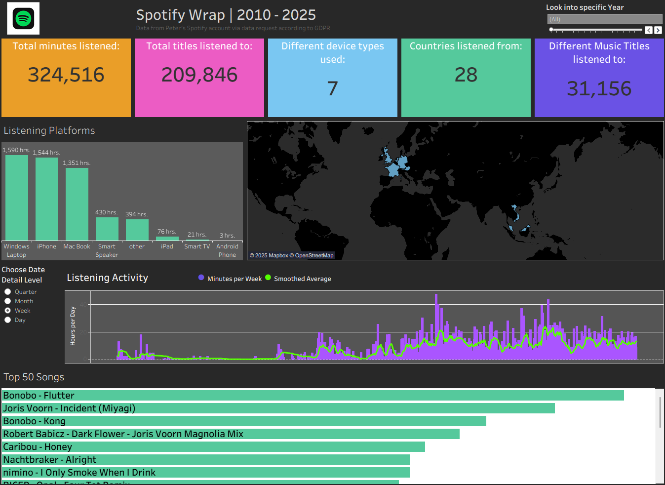
On the second day it was all about building elements from the sketch, find a design similar to the spotify color palette and bring it all together. Time was really of the essence and didn't allow for detours and otherwise worthwhile experiments.

Therefore I could not build everything I would have liked and had to make some compromises and keep it as a first version. Also I had to adapt the styling of each build element to the Spotify design.
Possible Next Steps aka. lots of small details to get more out of my work:
- Check the text in the cards, make it align along all cards
- Change the dashboard format from wide to long
- Re-adjust the distribution of elements on the dashboard in order to tell a clearer story
- Choose another color for the card of used device types in since there is no connection to the map
- Apply the year filter to every element including the Listening Activity
- Use the map as a filter
- Put the Top 50 Songs section to one side in order to use more vertical space
