DashboardWeek is approaching its end here at the Data School, and I genuinely admit that it was a fun, interesting and intense experience.
On Thursday, we spent the day working on the United Nation dataset of Millennium Development Goals Indicators.
For a Data Enthusiast, this sounds like being a kid lost in a candy shop, and indeed my feeling was like that!
Unfortunately, scraping out the candies from the packaging was not that easy, i.e. we had to make some Data Prep before starting visualizing anything meaningful with Tableau.
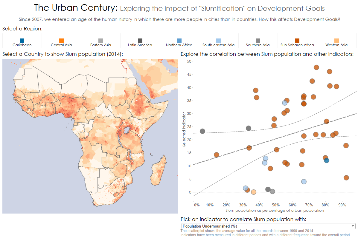
Here below you can find my final Dashboard.
In 2007, we entered a brand new age of the history of humankind: On the Earth, since that year, there are more people in cities than in rural areas.
My Dashboard correlates the rate of “Slumification” of the countries, with other Development Goals Indicators that the user can pick from a list.
This work was not expected to be revolutionary for development policies, but just to highlight some important and provoking questions, like:
What is the impact of such a revolution for development goals, and which challenges development policies have to face, in this new world?
Will development actions thought and planned for rural environments be effective in urban ones, like Slums?
Can communities of city dwellers help development policies, activating a virtuous snowball effect?

