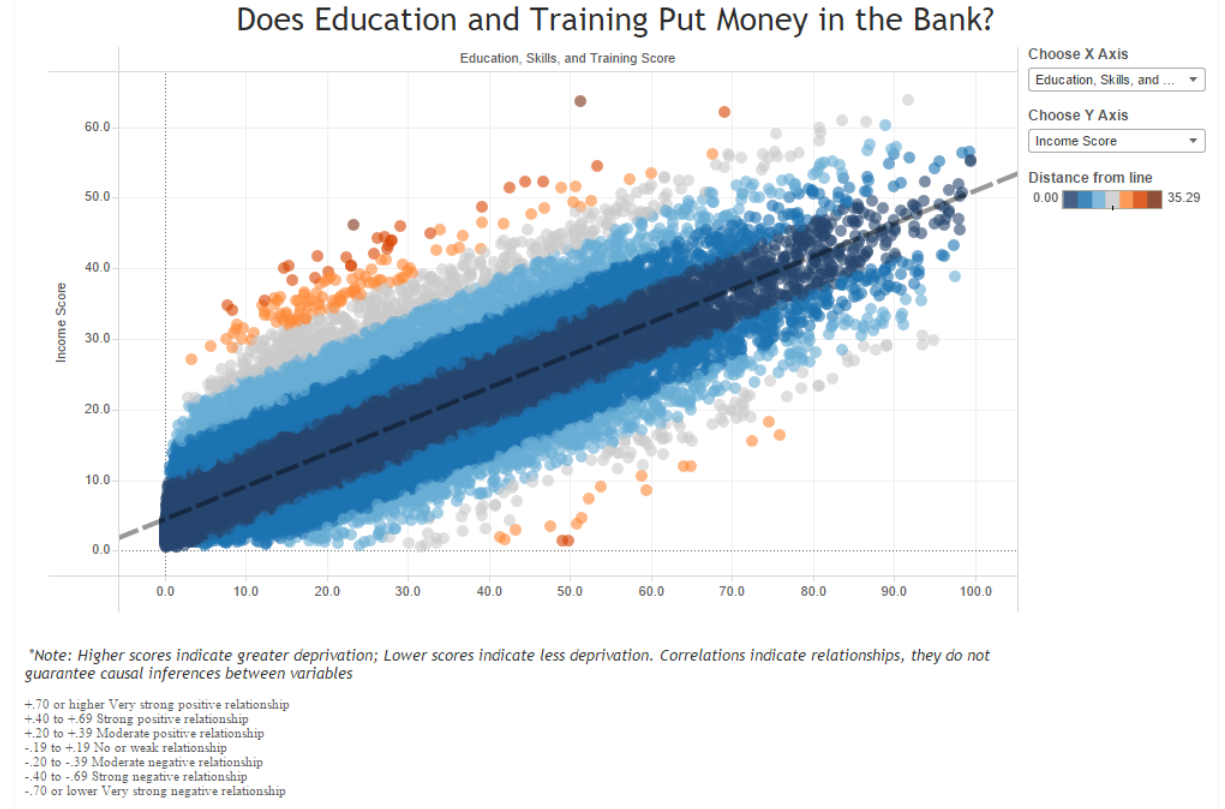
Last week, I spent some time working with the 2015 English Indices of Deprivation, and felt a bit of nostalgia for my days as a research assistant working out trend lines and Pearson correlations. So I decided to do a throwback to those days with this viz, and boy was I happy with those strong correlations (my smallest in the viz was around .80, I knew I would live to see the day)! However, although this is probably one of my more minimalistic vizzes (viz’s? vizusus?), the mechanics behind it weren’t so simple.
When you’re working with scatter plots, It’s pretty easy to display a trend line in Tableau. All you have to do is click on the analytics tab, and drag a trend line to your window. If you right click on the trend line and select “Edit Trend Lines,” you have further options to choose from, like showing confidence intervals or forcing the line to stay fixed when you click on your points.
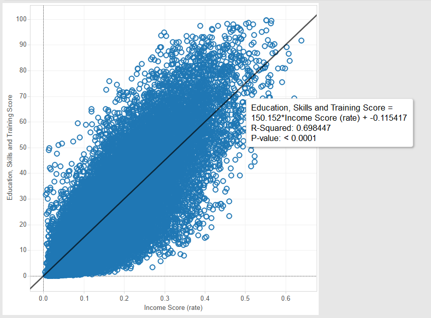
Here we can see Tableau provides us with some details, such as R-Squared and the P-value, if we hover over the generated trend line.
If we want to figure out details about the relationship between two variables, Pearson’s R is a commonly used measurement of both the strength and direction of a correlation. However, when we hover over the trend line generated in Tableau, we see that it only provides us with the R-Squared value (see image above). In order to get Pearson’s R, we need to take the square root of the R value. In this case, we get r = .84. For reference, Tableau provides a handy generalized table for how to interpret R (link):
+.70 or higher Very strong positive relationship
+.40 to +.69 Strong positive relationship
+.20 to +.39 Moderate positive relationship
-.19 to +.19 No or weak relationship
-.20 to -.39 Moderate negative relationship
-.40 to -.69 Strong negative relationship
-.70 or lower Very strong negative relationship
The problem with this method is that it’s a pain for users to first locate the R-squared value, and then have a calculator at hand to calculate the R value. It would be great if users could just hover and get the information they want from the tool tip. Like so:
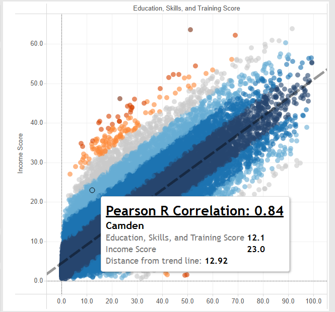
In order to bring the Pearson correlation into the tool tip, we’re going to need two calculations: 1. The actual Pearson correlation calculation, and 2. The covariance, which we need to calculate the Pearson correlation.
I am not exactly a statistician (yet ;)), and even if I was it would probably still take me forever and a half to figure out how to do the appropriate calculations in Tableau. However, a handy Tableau community thread gives some great instructions for how to calculate the components for your Pearson correlation (link).
Copied here, your formula for Covariance (x,y) will be:
(1/(SIZE()-1))*
WINDOW_SUM(
(([X]) – WINDOW_AVG(([X]))) *
(([Y]) – WINDOW_AVG(([Y])))
)
Where [X] and [Y] are the variables you have chosen to compare in the correlation (i.e. your row and column measurements).
Once you’ve got that, you can create another calculated field for the Pearson R, which is:
[Covariance (x,y)] /
(WINDOW_STDEV(([X]))*WINDOW_STDEV(([Y])))
Again, [X] and [Y] are the variables chosen for comparison.
At this point, all you have to do is drag your Pearson R calculation into the tooltip, do a bit of formatting, and voila, you can now hover over any point and see the Pearson R correlation for the variables in the view:
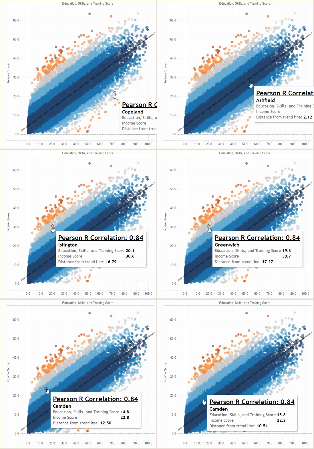
In my Indices of Deprivation viz, I also included information to demonstrate how far each point is from the trend line, which you can see in the tooltip as well as the colour legend. If you’re feeling tired with the formulas you had to calculate to get your Pearson correlation, I’m sorry to say you’re in for a whale of formulas ahead. The problem right now with Tableau’s trend line function is that it’s, well, not very functional. If you wanted to use it in a calculated field (e.g. to calculate a point’s distance from the trend line), there isn’t a very straightforward way to do so. What you have to do is essentially construct the trend line from scratch using calculations that will ultimately comprise the formula for a line. Remember high school math? The formula for any line is y=mx + b where m is your slope and b is your y-intercept. A trend line uses the same basic formula, but with some slight changes. Again, I do not hold the statistician hat, but someone over at interworks.co.uk has taken the time to write out a very well-detailed blog for how to first calculate your trend line, and then use that calculation to measure distance from point to line (link).
In my viz, I essentially replicated the calculations and also put them in folders for clarity’s sake, as outlined in the linked blog. The only thing I did differently when calculating my point distance to line is add an ABS() container around my formula in order to obtain all positive values. This is because I wanted to colour my dots strictly based on distance from the line, regardless of whether they were above or below the line. If I hadn’t included that ABS() container, this is how my points would have been coloured:
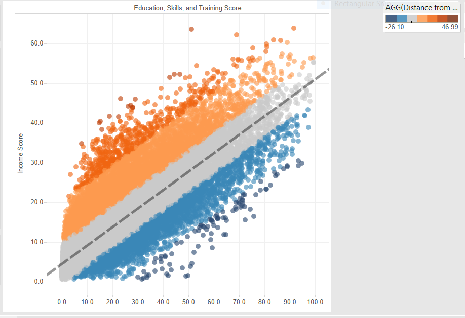
Instead, with just positive values in the ABS container, I get my original viz:
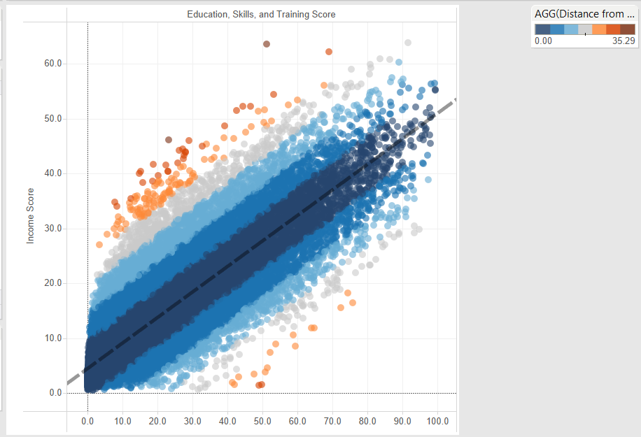
Tableau doesn’t exactly make it easy to work with trend lines, but if you’re willing to put some time and effort into figuring out the formulas, it is still possible to work interactively with calculated trend lines. In my experience, trend lines and correlations tend to be more dynamically used in academic settings, however, this doesn’t mean that other spaces can’t benefit from the same manipulations. My hope is that sometime soon, enough people in different industries and in the BI space will see their usefulness and urge Tableau to make things just a bit smoother.

